
Apple juice
For newhall Mains
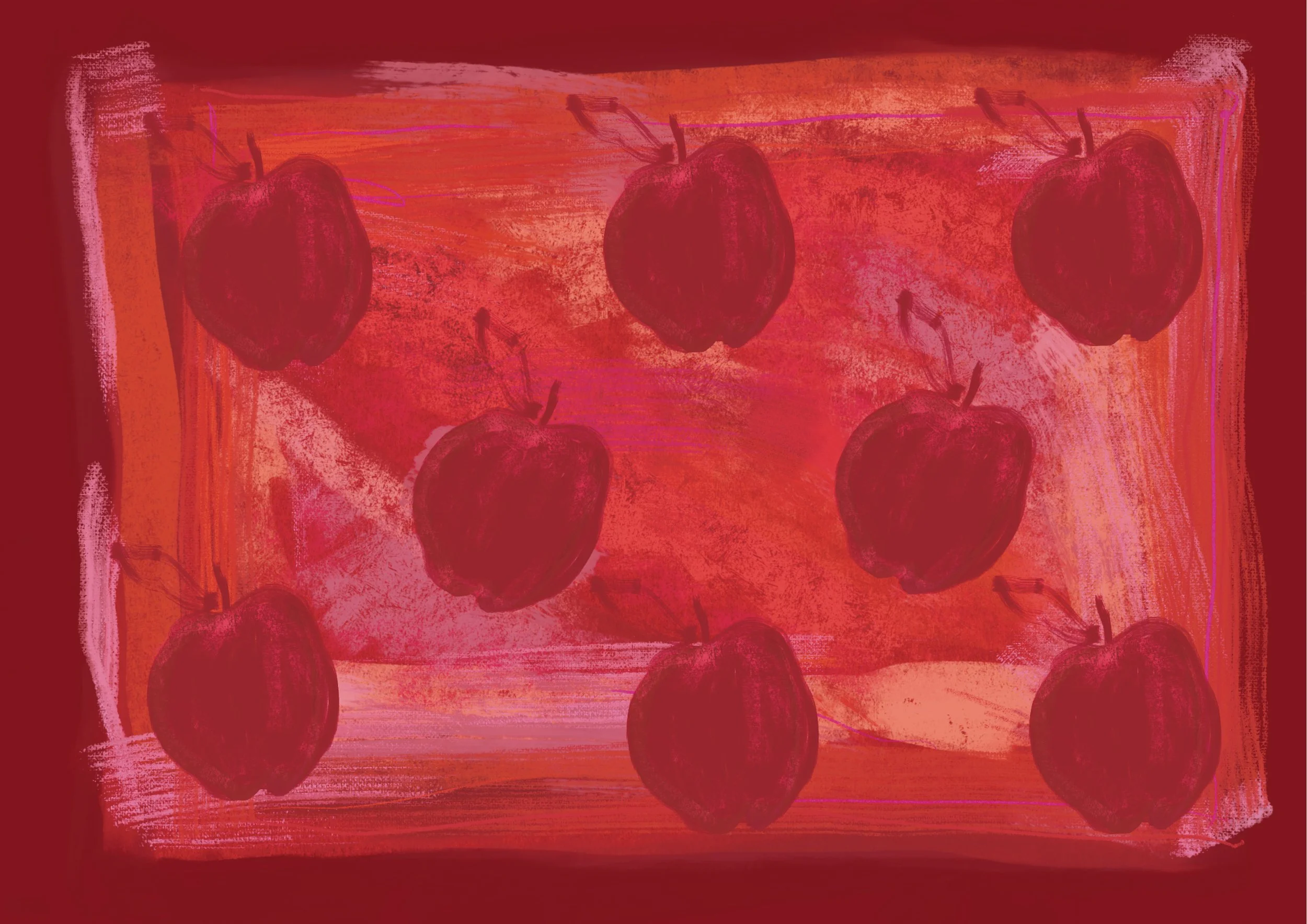
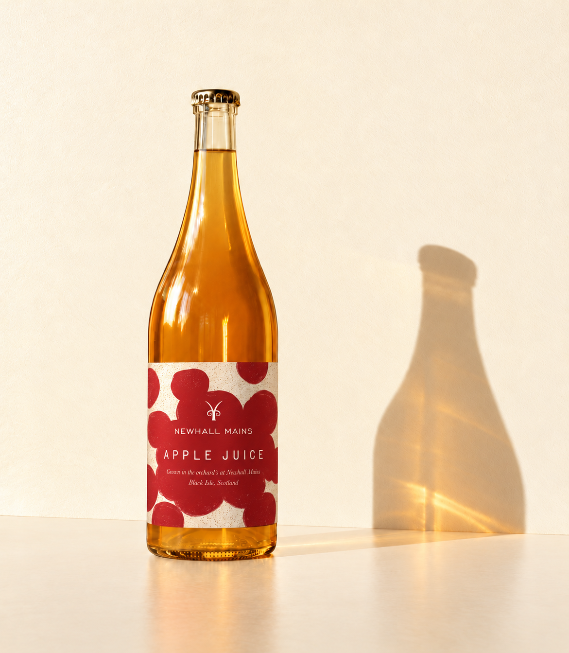
Newhall Mains asked me to design an apple juice label with the feel of an unexpected organic wine bottle. I explored a series of hand-drawn and hand-painted designs, pairing expressive apple artwork with distinctive typography. The chosen design combines rich reds, layered brushstrokes and elegant lettering to give the bottle a bold, contemporary character. Made with apples grown in the orchards of Newhall Mains on Scotland’s Black Isle, the juice deserved packaging that felt as considered as what was inside.
the brief
the chosen design
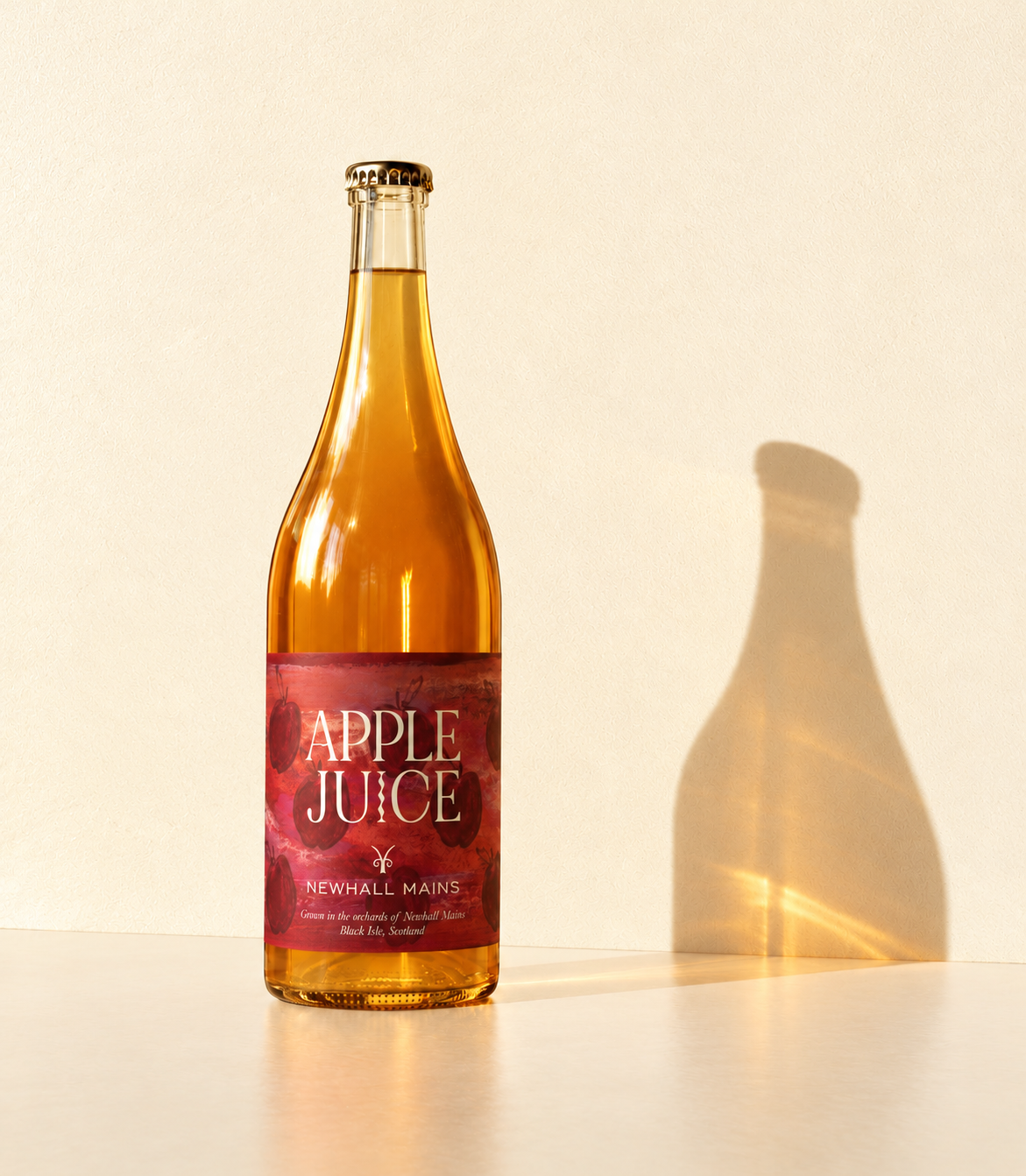
Hand-painted apples, rich red tones and layered brushstrokes give the chosen label its character. Paired with elegant typography, the artwork brings the feel of contemporary organic wine packaging to Newhall Mains’ orchard-grown apple juice.
A play on colour
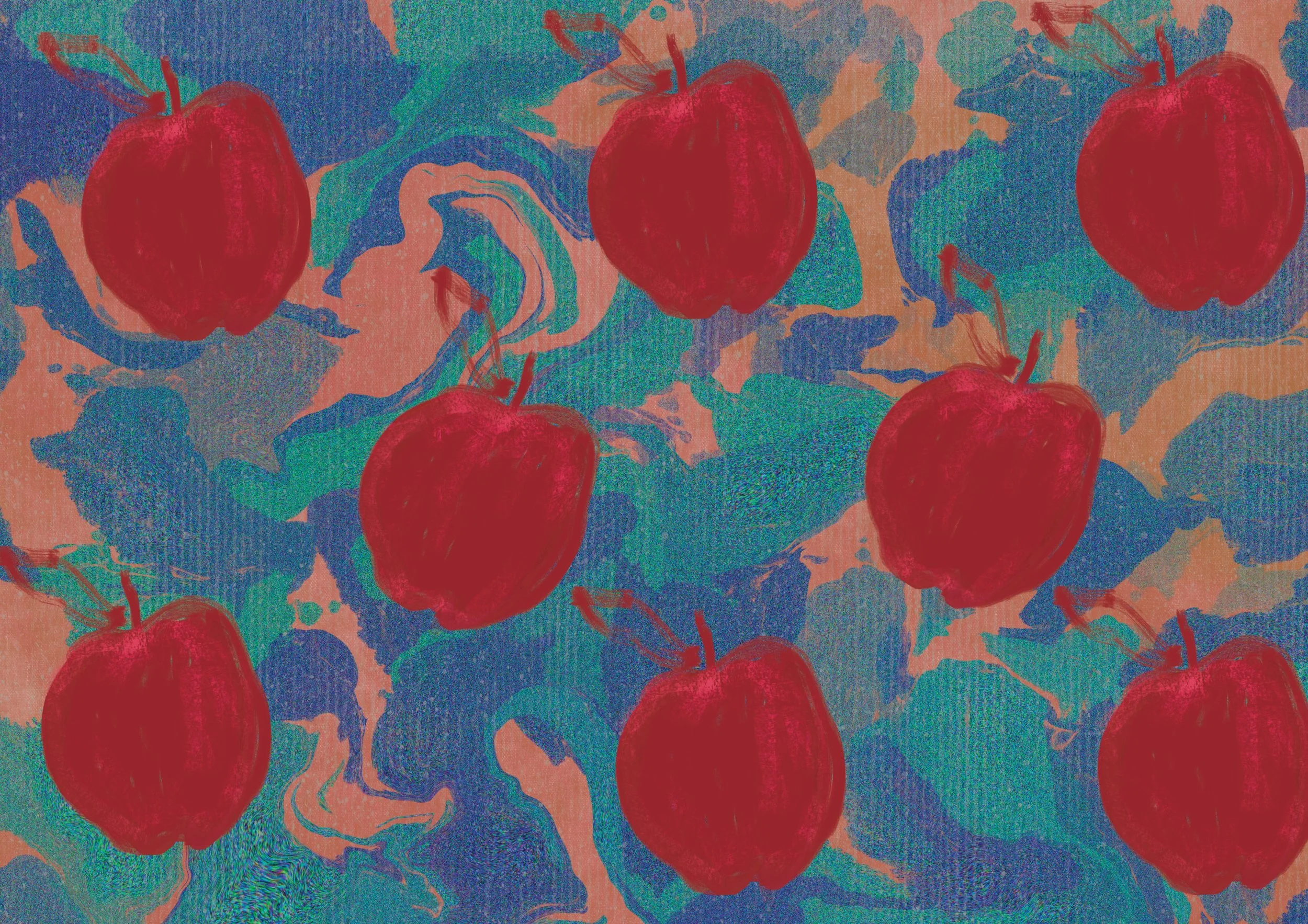
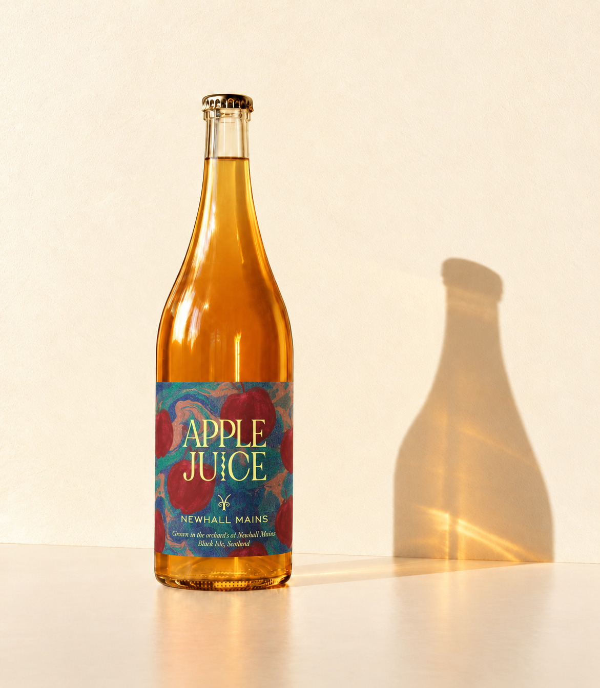
This direction pairs hand-painted red apples with a swirling palette of blue, green and peach. Pale yellow lettering brings contrast to the layered artwork, exploring a more playful, unexpected take on the organic wine-inspired brief.
A simpler expression
Hand-painted red apple shapes sit against a softly speckled cream background, with generous spacing and understated typography. This direction explores a quieter approach, letting the bold shapes and handmade texture give the label its character.